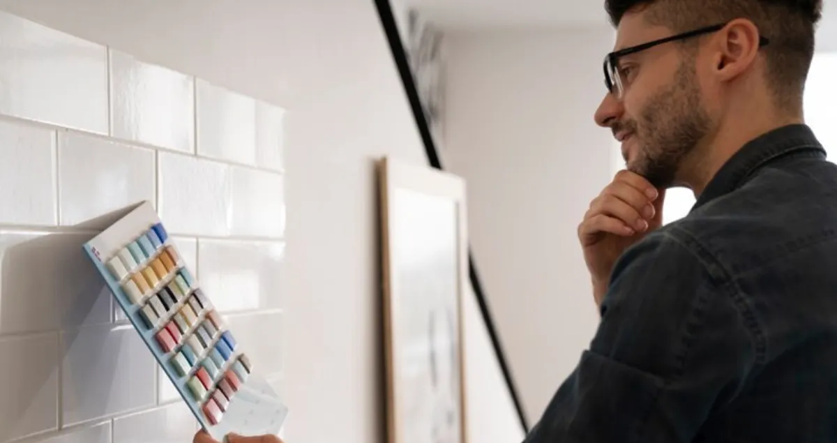
Design Secrets: Using Grout Color to Enhance or Tone Down Your Tile Look
Grout: The Unsung Hero of Tile Design
In the world of tile design, the tile usually gets all the attention—but those clean lines, stunning patterns, and seamless transitions? They owe much of their magic to something far more subtle: grout. At Timeless Creations, we treat grout not as an afterthought, but as an essential design element—the connective tissue that can make or break the final aesthetic.
Grout plays multiple roles. Functionally, it secures and seals your installation. But visually? It’s transformative. The right grout color can dramatically shift the tone of your space. A high-contrast grout—think charcoal against white subway tile—brings drama, accentuates pattern, and adds graphic energy. On the other hand, a tone-on-tone grout fades into the background, letting materials and textures take center stage, and giving the room a smooth, cohesive feel.
And it’s not just about color. Grout width also influences the look. Tight joints give a modern, seamless finish—ideal for large format tiles—while wider joints can add texture or enhance rustic, handmade tiles. The grout finish itself (sanded, unsanded, epoxy, etc.) affects not only appearance but longevity and cleanability, especially in high-moisture areas like bathrooms and kitchens.
Our team selects grout with as much care as we select tile—factoring in lighting, texture, pattern, and purpose. During your Dream Consultation, we guide you through these decisions to ensure your grout enhances—not distracts from—your vision.
Because in luxury design, it’s the smallest details that make the biggest difference. Grout might be the quietest element in the room, but when done right, it’s what makes the whole design sing.
Tone on Tone: Letting the Tile Speak
In luxury design, sometimes the most powerful statements are made in whispers. That’s the essence of tone-on-tone grout styling—a refined technique that allows your tile to take center stage without distraction. At Timeless Creations, we often recommend this approach when the goal is a clean, seamless, and elevated look that feels both timeless and effortlessly modern.
When you match your grout closely to your tile—whether it’s soft white with porcelain, sand tones with limestone, or dove gray with natural marble—you create a continuous surface where the eye flows freely. The lines between tiles dissolve, and the material becomes the star. This subtle blending is ideal for large-format installations, where minimal grout lines already contribute to the sense of openness and scale. With tone-on-tone, the effect is heightened—more serene, more cohesive, and visually expansive.
This approach thrives in spa-like bathrooms, where you want the space to evoke calm, quiet, and clarity. Picture soft travertine-look tiles running floor to ceiling, their gentle color echoed in barely-there grout. The result? A sanctuary that soothes the senses.
In minimalist kitchens, tone-on-tone grout maintains visual purity and architectural precision. It pairs beautifully with modern cabinetry and clean lines, reinforcing a look that feels intentional and grounded—not busy or cluttered.
But make no mistake: this isn't about playing it safe. It’s about understanding that restraint is a form of sophistication. When grout blends, texture and material take center stage. Your space speaks with elegance—not volume.
At Timeless Creations, we design with nuance. And sometimes, letting the tile speak means giving grout a supporting role that’s subtle, smart, and undeniably luxurious.
High Contrast, High Impact
If you’re drawn to bold, graphic interiors, contrast grout is the unsung hero your design has been waiting for. At Timeless Creations, we often say grout is where the subtle becomes spectacular—and nowhere is that truer than in high-contrast applications. This technique transforms standard tile into a striking design element that grabs attention, outlines pattern, and adds an architectural layer of drama.
Think of bright white subway tile with charcoal grout—clean, timeless tile suddenly becomes a sharp, modern statement. The contrast frames each piece, turning your wall into a grid of intentional lines and rhythm. It’s especially powerful in geometric layouts like herringbone, chevron, or stacked tile, where pattern is the focal point. Contrast grout doesn’t just outline the design—it amplifies it.
This method is ideal for areas where you want to make a statement:
Kitchen backsplashes that feel dynamic and structured
Powder room walls that dazzle in small doses
Shower surrounds where bold meets function
Entryway accents that create a dramatic first impression
But contrast grout isn’t just for modern designs. It can also enhance vintage charm in black-and-white penny tile, or bring warmth to handcrafted ceramics with earthy hues and smoky joints. The key is intentionality—choosing a color combination that complements your palette while bringing definition and visual weight.
At Timeless Creations, we guide you in choosing the right grout to not only support your vision, but to elevate it. Because when every line tells a story, grout becomes more than filler—it becomes the framework of great design.
Warm vs. Cool: How Undertones Change the Mood
Grout may be subtle, but its undertone holds the power to transform the entire mood of a room. At Timeless Creations, we know that even “neutral” grout isn’t one-size-fits-all. Whether cool or warm, grout color affects how your tile reads, how your space feels, and how your overall palette comes together in elegant harmony.
Cool-toned grout—such as soft grays, icy whites, or bluish taupes—lends a crisp, contemporary edge to any installation. These hues complement sleek surfaces, monochromatic schemes, and modern materials like glass, marble, or high-gloss ceramic. Cool tones help sharpen visual lines, brighten spaces, and reinforce minimalist aesthetics. Perfect for open-concept kitchens, modern bathrooms, or any space where clarity and lightness are key.
On the flip side, warm undertones—like beige, sand, putty, or mocha—add richness, softness, and depth. Paired with natural stone, handmade tile, or matte finishes, warm grout brings a sense of comfort and timelessness. It enhances organic textures, draws out subtle tones in natural materials, and beautifully bridges tile with wood, brass, or warm-toned walls. Ideal for cozy powder rooms, rustic-modern kitchens, or serene spa retreats.
The choice of grout undertone is about more than matching a sample. It’s about understanding the temperature of your entire design palette—flooring, fixtures, cabinetry, lighting, and even the sunlight filtering through your windows. That’s why during your Dream Consultation, we evaluate the space holistically, guiding you toward a grout tone that doesn’t just blend—it balances.
Because luxury is about more than looks—it’s about how a room makes you feel.
Grout as a Design Element in Mosaic and Patterned Tile
In the world of mosaic and patterned tile, grout isn’t just functional—it’s foundational to the artistry. At Timeless Creations, we treat every grout line as an opportunity to amplify, define, and elevate the design. In these intricate layouts, grout becomes more than filler—it becomes the brushstroke that completes the visual composition.
With mosaics, where dozens (or hundreds) of small pieces work together to form a unified pattern, grout is the negative space that makes the design legible. Whether you’re working with glass, stone, or ceramic, the color and spacing of the grout can completely shift the impact. A contrasting grout brings attention to each tile, defining shapes and adding rhythm to the wall. A tone-on-tone grout softens the transitions and lets the material shine through subtly.
In geometric layouts like arabesques, hexagons, chevrons, or basketweaves, grout adds structure and depth. It emphasizes edges, enhances repetition, and introduces shadow where the tile alone might fall flat. With the right lighting—natural or architectural—these lines cast subtle shadows that change throughout the day, adding motion and mood.
We've designed shimmering accent walls where the grout choice enhances metallic glass mosaics, making them dance in the light. In other projects, we’ve used a slightly darker grout to sculpt dimension into soft-toned natural stone, bringing warmth and weight to the pattern.
This level of detail requires more than just the right product—it demands precision, vision, and intention. That’s why every patterned tile project at Timeless Creations is handled with the care of a commissioned art piece. Because when every line matters, grout isn’t just support—it’s part of the story.
Keeping It Classic: Grout Choices That Never Go Out of Style
Trends come and go, but timeless design is forever. At Timeless Creations, we understand that true luxury lies in longevity—the kind of beauty that doesn’t fade, date, or fall out of favor. When it comes to tile and grout combinations, there are a few pairings that have stood the test of time and continue to elevate interiors with effortless sophistication. These aren’t just safe choices—they’re style staples that set the standard for enduring elegance.
Here are three grout combinations we frequently recommend for their classic appeal:
1. White Tile + White Grout
Clean. Crisp. Endlessly versatile. This combination is a go-to for spa-like bathrooms, bright kitchens, and minimalist spaces. It creates a soft, seamless backdrop that lets light bounce and the room breathe. Whether it’s glossy subway tile or matte ceramic, white-on-white feels fresh, refined, and forever in style.
2. Natural Stone + Matching Grout
When working with marble, limestone, or travertine, we often use tone-matched grout to let the material’s natural beauty take center stage. This approach enhances the organic texture and veining without visual interruption. It’s especially powerful in floors and showers, where continuity reinforces a calm, grounded atmosphere.
3. Black Tile + Dark Charcoal Grout
For those who gravitate toward bold, modern spaces, this pairing delivers drama and depth. Dark grout with black tile creates a moody, architectural look that’s sleek and powerful. It’s ideal for statement walls, powder rooms, and high-contrast kitchens that don’t shy away from impact.
These combinations aren’t about following trends—they’re about creating designs that feel relevant now and years from now. At Timeless Creations, we help you make choices rooted in clarity, intention, and enduring luxury.
More Than Aesthetic: Practical Considerations
In luxury tile design, beauty is only half the equation—performance and practicality matter just as much. At Timeless Creations, we believe that a truly refined space doesn’t just look exceptional on day one—it continues to perform, impress, and endure for years to come. That’s why when it comes to grout, we go beyond color and texture to consider how it will live in your space.
One of the biggest practical concerns? Maintenance.
Light-colored grout may look crisp and elegant, but it can show dirt and discoloration more quickly—especially in high-traffic areas like kitchen floors or backsplashes behind cooktops. That’s why we always assess both the design and the function of a space before finalizing grout selections.
For kitchens, mudrooms, and bathrooms, we often recommend stain-resistant or epoxy-based grouts, which offer superior protection against moisture, grease, and daily wear. These advanced formulations not only resist stains but also reduce the need for constant scrubbing or resealing. They’re perfect for busy households that want the best of both worlds: effortless elegance and real-world resilience.
Even beyond product choice, our MasterCraft Remodeling Process includes a grout-specific maintenance plan. We show clients how to care for their tile investment—whether it’s a gentle cleaner for delicate stone or resealing recommendations for longevity. It’s all part of our commitment to delivering luxury that doesn’t just look good—it works for your life.
Because at Timeless Creations, every detail is intentional, and every design is built to last.
From Sample to Installation: Our Expert Guidance
At Timeless Creations, luxury is never left to chance—especially when it comes to the details that hold your vision together. Grout may seem like a finishing touch, but in our world, it's an integral part of the design story. That’s why our process is built on deliberate decisions, expert guidance, and flawless execution—from the first sample to the final clean line.
It all begins with your Dream Consultation, where we dive deep into your vision. We don’t just talk tile—we talk tone, light, and feeling. How do you want your space to look in the morning sun? What contrast feels bold without being overpowering? Which undertone harmonizes with your cabinetry, countertops, or wood floors? Grout color isn’t selected in isolation—it’s chosen in context, using physical samples, mockups, and lighting evaluations to ensure every choice feels just right.
Our design team walks you through the full impact of grout, helping you visualize how it will interact with texture, pattern, and finish. Whether you’re leaning toward a tone-on-tone, high-contrast, or neutral approach, we make sure your decision aligns with the overall aesthetic and the lifestyle demands of the space.
Then comes installation—where our Certified Tile Installer (#1881) brings the design to life with precision, care, and unmatched attention to detail. Every line is sharp. Every transition is seamless. Every edge tells a story. Because to us, grout isn’t filler—it’s the framework.
At Timeless Creations, we don’t move on until it’s 100% perfect. That’s not just a promise—it’s our process.


